Tone, undertone and phototype: three words that get confused
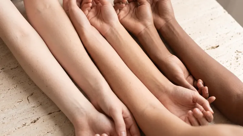
Skin tone is the surface colour you see in the mirror: fair, light, medium, tan, deep. Undertone is the subtle hue beneath that surface, warm, cool, neutral or olive, and it does not change when you tan or lose your tan. Phototype is something else again: a measure of how your skin responds to sun. The three are routinely used as if they were interchangeable, and most bad foundation matches start there.
Tone is easy. You can see it, and it shifts through the year. Undertone is the hard one, because it is a relative judgement about a hue that is usually masked by redness, tan and the colour of the light you are standing in. Two people with identical surface tone can have opposite undertones, and the same foundation will look pink on one and sallow on the other.
Phototype, usually described with the Fitzpatrick scale, is a dermatology tool about burning and tanning. It overlaps with tone but says nothing about undertone: a type III can be warm, cool or olive. Keep the three apart and the rest of this guide gets much simpler.
Warm, cool, neutral and olive: what each actually looks like
Undertone is a spectrum rather than four boxes, but the four labels are how makeup is sold, so they are worth knowing.
- Warm. Yellow, golden or peach beneath the surface. Skin tends to look richer in gold jewellery and in earthy, orange-leaning colours. Warm is common at every depth of tone, from very fair to very deep.
- Cool. Pink, red or bluish beneath the surface. Skin looks clearer in silver and in blue-based colours. Cool undertones are often confused with surface redness, which is a different thing: redness sits on top and comes and goes, undertone does not.
- Neutral. No strong lean either way, or a balance of both. Neutral skin is forgiving of most foundation shades and both metals, which is why it is the most commonly claimed and the most commonly misdiagnosed.
- Olive. A green or grey-green cast that sits over a warm or neutral base. Olive skin is the one most makeup ranges handle badly, because it reads as ashy in pink-based shades and orange in golden ones. If every foundation looks slightly wrong on you, olive is the first thing to consider.
The classic tests, and how reliable each one is
Every undertone guide repeats the same four tests. They are useful as a starting point and unreliable as a verdict, and it is worth knowing why.
| Test | How it works | Reliability | Why it fails |
|---|---|---|---|
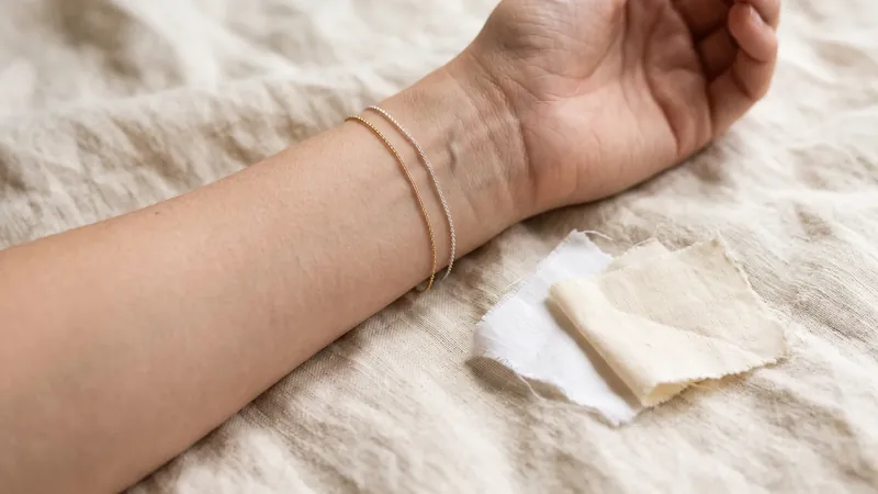
| Vein colour | Look at the veins on the inside of your wrist in daylight. Blue or purple suggests cool, green suggests warm, hard to say suggests neutral. | Low to moderate | Vein colour depends on vessel depth and skin thickness as much as undertone, and veins are hard to read on deeper or tanned skin. |
| Jewellery | Hold gold and silver against bare skin. Whichever makes the skin look clearer and more even is your lean. | Moderate | Personal preference and habit colour the judgement. Neutral and olive skins often look fine in both. |
| White versus cream | Hold a bright white and an off-white or cream fabric under your chin. Bright white flatters cool, cream flatters warm. | Moderate | Needs daylight and a bare face. Surface redness pushes people towards cream even when the undertone is cool. |
| Sun response | Burn first and tan little suggests cool; tan easily suggests warm. | Low | This is phototype, not undertone. Plenty of cool-toned people tan well and warm-toned people burn. |
If three of the four agree, you probably have your answer. If they disagree, the disagreement is the finding: you are most likely neutral or olive, and the next method is the one to trust.
A more reliable method: swatch, wait and photograph in daylight
The tests above try to infer undertone from a proxy. The direct method is to test the thing you actually care about, which is how colour sits on your skin.
- Start with a bare, calm face. No makeup, no fresh exfoliation, no flushed skin from a hot shower. Redness skews every reading cool.
- Choose three shades of the same depth in a foundation or concealer range: one labelled warm or golden, one cool or rosy, one neutral. Depth should match your jaw, not your hand.
- Swatch all three along the jawline, from cheek down onto the neck, in stripes a finger-width apart.
- Wait ten to fifteen minutes. Many formulas oxidise and shift darker or more orange as they dry. Judging immediately is the most common mistake.
- Look in daylight near a window, not under bathroom bulbs, and then take a photo in the same light with no filter. The stripe that disappears is your match. The one that goes grey is too cool for you; the one that goes orange is too warm.
Do this once properly and you have your answer for years. Undertone is stable; only depth moves with the seasons, so you may need a lighter and a darker shade of the same undertone rather than a different undertone in summer.
If the neutral stripe looks faintly pink and the warm stripe looks faintly orange, and nothing disappears, you are probably olive. Look for shades described as olive, green-neutral or yellow-neutral, or mix a drop of a green-leaning corrector into a neutral base.
Why undertone matters beyond foundation
Undertone is usually discussed as a makeup problem, but it shapes how several skincare concerns look and how products behave on you.
- Foundation and concealer matching. The obvious one. A depth match with the wrong undertone is why foundation can look right in the bottle and wrong on the face.
- How redness reads. On cool and fair skin, redness looks pink and obvious. On warm and olive skin the same inflammation reads more brown or muddy, and it is often missed or mistaken for pigmentation. If you are olive and your cheeks look grey-brown rather than red after a hot drink, that may still be flushing.
- How dark spots read. Post-inflammatory marks tend to look red or purple on cool skin and brown on warm or olive skin, and they usually linger longer on deeper tones. The dark spots guide explains the difference between a red mark that will fade and a brown mark that needs active treatment.
- Sunscreen white cast. Mineral filters leave a cast that reads chalky on cool skin and ashy-grey on olive and deeper skin. Tinted mineral formulas are tinted warm or neutral by default and can look orange on cool undertones. The sunscreen guide covers which formats avoid the problem.
- Brightening ingredients. Dullness on warm skin often reads yellow; on cool skin it reads grey. A vitamin C serum helps either, but knowing your lean tells you what improvement should look like. Our dullness guide goes further.
Why photos lie about undertone
Almost everyone has tried to work out their undertone from a selfie. It is the least reliable method available, for reasons that are physical rather than personal.
White balance. A camera has no idea what colour the light is, so it guesses, and it guesses from the whole scene. Stand in front of a warm wooden door and the camera cools everything, including your face. Stand in front of a blue wall and it warms you. The same face can swing from pink to yellow between two photos taken a metre apart.
Warm bulbs. Most indoor lighting is around 2700 to 3000 kelvin, which is distinctly orange. Even after the camera corrects, residual warmth usually survives, and it reads as a warm undertone that is not there. Cool-white LEDs push the other way.
Screens and compression. Your phone screen has its own colour calibration, often with a night-shift mode that warms everything in the evening. Social apps compress colour further.
Tan and redness. Surface colour sits on top of undertone and photographs more strongly. A sunburned cool-toned face photographs warm. A flushed warm-toned face photographs cool.
If you want to use a photo at all, take it in indirect daylight next to a window, hold a plain white sheet of paper in frame so the camera has a reference, turn off every filter and night mode, and treat the result as one data point among several. This is also exactly why our guide to how AI skin analysis works spends so long on lighting: the camera is the weakest link for any colour reading.
What Beeuty estimates, and what it does not
Because undertone and phototype get confused, it is worth being precise about what the app actually reports, so you do not expect something it was never designed to deliver.
Beeuty estimates your phototype on the Fitzpatrick scale from the selfie, using the apparent constitutive colour of your skin corrected as far as possible for lighting. That is a sun-response category, useful for understanding sunscreen priority and pigmentation risk, and it is explained in full in the Fitzpatrick guide. It also estimates tone evenness: how uniform your skin colour is across zones, and where visible redness, dark spots and sun damage sit. The sun damage scan is where that shows up most directly.
Beeuty does not estimate makeup undertone. It will not tell you whether you are warm, cool, neutral or olive, and it does not recommend foundation shades. The reasons are the ones in the previous section: a phone camera under uncontrolled light cannot measure the subtle hue beneath the surface reliably enough to be worth reporting, and a wrong answer would send you to the shop with false confidence. The swatch method above is slower and far more accurate.
What the app can do is adjacent and useful. Once you know your undertone from a proper swatch, Beeuty's zone map shows you where redness and pigmentation actually sit, which tells you where colour correction and targeted treatment are worth the effort. Combined with the skin type reading, that is most of what you need to pick a base that behaves. If you are not sure of your type, the skin type quiz is a two-minute starting point.
Analysis photos are deleted after 30 days, every reading is an estimate of appearance rather than a diagnosis, and if a patch of colour change is new, asymmetrical or growing, a dermatologist should look at it regardless of what any app or test says.
Sources
- The validity and practicality of sun-reactive skin types I through VI (Fitzpatrick, 1988), Archives of Dermatology via PubMed
- Sunscreen FAQs, American Academy of Dermatology
- How to fade dark spots in skin of color, American Academy of Dermatology
Know your phototype before you shop for shades
Beeuty estimates your Fitzpatrick phototype and maps where redness and pigmentation sit, so you know what you are colour-correcting and why. Free on iPhone and iPad.